The client, Daniel Kim, a certified personal trainer, needed professional business cards to stand out to both current and potential clients.
Wanting to avoid the typical barbell or dumbbell logo, we decided to incorporate his last name, 'Kim,' in a unique way.
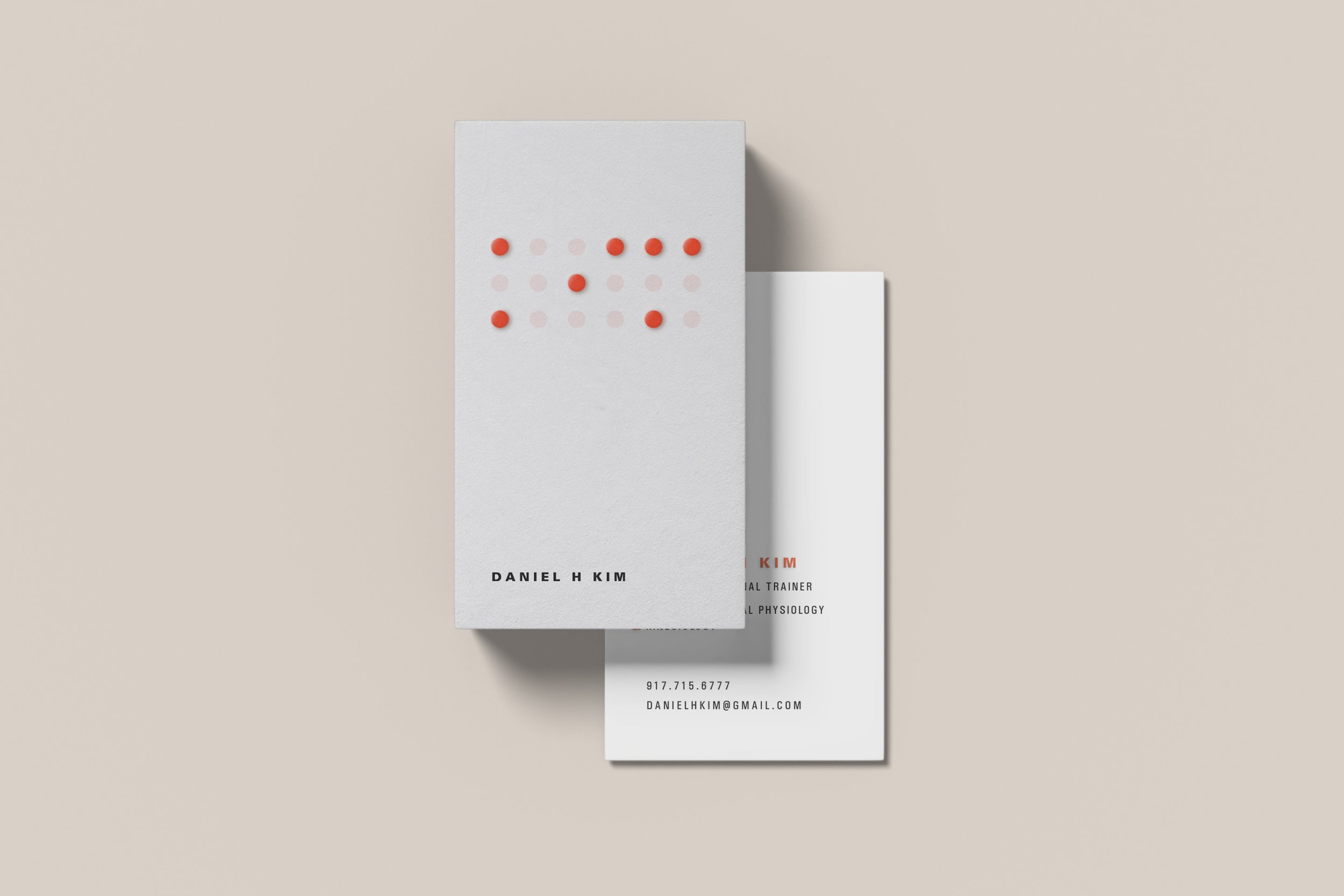
Logo
The final logo uses Braille to spell 'KIM,' designed with an embossing technique to make the characters tactile, honoring one of Daniel's clients who is blind. This inclusive and distinctive design set Daniel apart from other trainers’ business cards, adding an element of curiosity and engagement.
It received positive feedback because it sparked conversations and built excitement around his brand. The story behind the logo made a lasting impression, turning business cards into memorable connections.
